Why a Good-Looking Website Doesn’t Convert
A good-looking website doesn’t always mean better results. Many business owners ask why isn’t my website converting visitors even when the design looks professional. This blog explains what’s really stopping customers, the common mistakes websites make, and how small changes can turn visitors into enquiries and sales.

Deepak Sharma
SEO consultant
Feb 08, 2026 | 6 min. read
Your website looks professional.
It loads properly. It feels modern. People even tell you it looks great.
But enquiries are low. Sales are slow.
And you’re left wondering why isn’t my website converting visitors, even though nothing looks obviously wrong.
This is something I hear all the time from small business owners. A site can look polished and still struggle to bring in customers. In many cases, the problem isn’t the design at all.
If you’ve ever thought my website looks good but doesn’t convert, or quietly asked yourself why a website that looks good still doesn’t sell, you’re not alone. This is a common issue — and it’s usually fixable once you understand what’s actually going on.
Why a Website That Looks Good Still Doesn’t Convert
A good-looking website doesn’t automatically mean a website that sells.
Design helps first impressions, but it doesn’t do the job on its own.
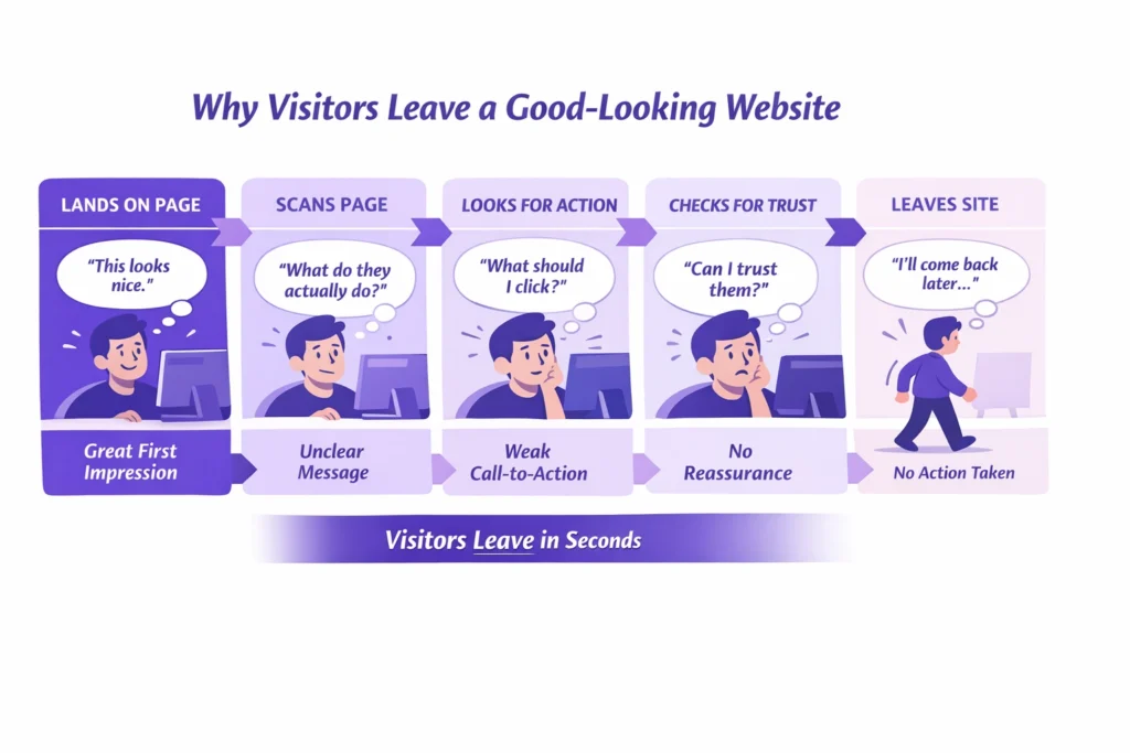
Most sites are built to look nice, not to guide visitors toward a decision. They focus on layout, colours, and images, but forget to answer the basic questions running through a visitor’s head: Is this for me? Can you help me? What should I do next? When that clarity and value proposition are missing, people hesitate — and hesitation usually means leaving.
This is one of the most common reasons a website doesn’t convert. Visitors aren’t confused because the site looks bad. They leave because they’re unsure, unconvinced, or don’t feel confident enough to take the next step. That’s why customers often leave without buying, even on websites that look polished and professional.
Before doing SEO, my main focus is to optimize the website content according to the target audience and search engines. The website must follow EEAT (Experience, Expertise, Authoritativeness, Trustworthiness) guidelines, which Google prefers. Design may attract visitors, but content builds trust, shows experience, and encourages visitors to take action. Simply put, most traffic is wasted if the website is not optimized for users.
Once you understand this, it becomes easier to spot where things start going wrong, and that’s where most websites begin to lose potential customers.
📊 Most websites convert very few visitors
On average, websites convert only about 2.35% of visitors into a meaningful action like a lead or signup, meaning roughly 97 out of every 100 people leave without converting. That’s the reality for most sites today.
Why it matters:
This shows that even if your design looks great, most sites don’t turn browsers into leads — and you need to focus on conversion factors, not just aesthetics.
Common Website Conversion Mistakes Business Owners Make
After reviewing a lot of small business websites, the same issues come up again and again. They’re easy to miss when you’re close to your own site, but they’re usually clear to visitors.
Design over clarity
The site looks polished, but it’s not obvious who it’s for or how it helps. Without a clear message, visitors don’t feel confident enough to act.
In my 10 years of career, before designing a website, I have learned that it is important to understand the business goals, the target audience, their problems, and the right solutions. Only after that do I create the content accordingly. The most important part is understanding the user journey and building content section by section. CTAs should be used properly so users can easily make the required booking.
Assuming visitors know what to do next
Many websites expect people to figure it out on their own. When there’s no clear direction, visitors hesitate — and hesitation often means leaving.
Mostly, I see website designers focus on building beautiful websites without understanding the content. Business owners often make the same mistake. They see a good-looking website and feel satisfied, but the real value lies in whether the website content is fully optimized and targets the right audience.
Weak call-to-action problems
Buttons are vague, hidden, or trying to do too many things at once. If the next step isn’t obvious, people won’t take it.
For example, suppose you are walking in a beautiful garden. You see trees, then a few steps ahead you see flowers, fountains, and benches to sit and rest. After that, you walk through beautiful paths with flower-covered roofs and again find benches to sit. On a website, those benches are CTAs, where visitors pause, rest, and fill out a form or make an enquiry. That’s why understanding the user journey is so important.
Ignoring user experience and conversion issues
Small frustrations add up. Cluttered pages, confusing layouts, or too much text can quietly push visitors away.
A common mistake many business owners make is focusing on showing their business and explaining their services, instead of clearly offering solutions to users. They often do not show case studies, client reviews, past work, or results that build trust with first-time visitors. Another mistake is making the design too complex, especially during form submission. Filling out a form should take no more than two or three clicks. Complex and confusing layouts frustrate users, causing them to leave the website.
Slow pages and heavy visuals
This is a big one. Website speed hurting sales is real. If pages take too long to load, people leave before they even see what you offer.
Lastly, when I worked on a coaching website project, it looked good with great animations and visuals. However, when I audited it, I found that it was slow on both mobile and desktop, taking 5 to 7 seconds to load. You know that visitors wait an average of only 3 seconds before leaving a site. I explained this mobile website optimization issue to the client and then fixed it.
Missing trust signals for website customers
No reviews, no proof, no reassurance. When visitors don’t feel safe or confident, they won’t get in touch.
How is trust built on a website? A good-looking design is not enough. When you add real business images, videos, client reviews, case studies, and show real results to visitors, trust is built. A good-looking website is like a book with a beautiful cover. When you add trustworthy content inside it, users stay longer and feel confident that this is the right business to solve their problem.
These are all clear signs your website isn’t converting — not because your business isn’t good, but because the site isn’t doing enough to support it.
Once these mistakes are fixed, many websites start performing very differently, even without a full redesign.
📊 Slow loading loses more than half of visitors
Research finds that 53% of mobile visitors will leave a website if it takes longer than 3 seconds to load, and sites that load slower tend to have much higher bounce and abandonment rates.
Why it matters:
This directly ties into why customers leave without buying — performance issues like slow pages can stop visitors before they even see a clear offer or call to action.
How to Fix a Website That Isn’t Converting
If you’re trying to work out how to fix a website that isn’t converting, the good news is this: it’s rarely about starting over. In most cases, a few focused changes make more difference than a full redesign.
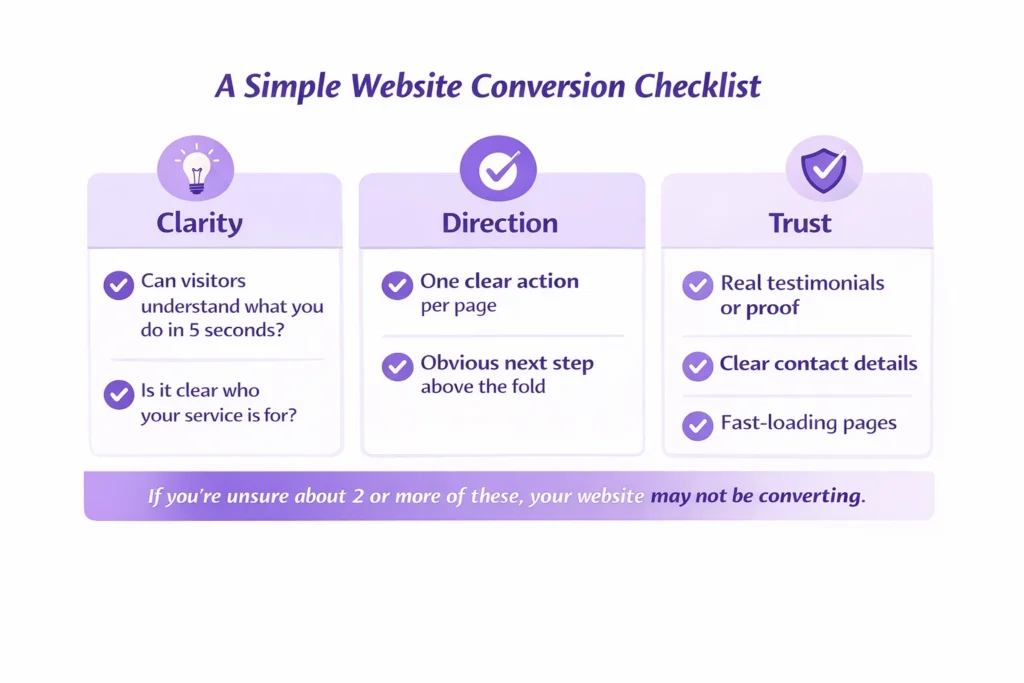
Start with your main message. A visitor should understand what you do and who you help in five seconds or less. If they have to scroll, guess, or piece things together, you’ve already lost them.
Next, be clear about who your service is for and how you help. Many websites talk around the problem instead of addressing it directly. When people recognise themselves in your message, they’re far more likely to stay and engage.
Keep each page focused on one clear action. When a page asks visitors to call, email, download, and book all at once, nothing stands out. One clear next step works far better than several competing ones.
Proof matters more than most people realise. Testimonials, short case examples, or even simple client quotes help remove doubt. This is a key part of how to improve website conversions, especially for service-based businesses.
Page speed also plays a bigger role than it seems. Heavy images, unnecessary animations, or cluttered layouts can quietly push people away. Improving load time and removing distractions often helps fix a low conversion rate without touching the design.
Finally, look closely at your wording. Good copy answers the unspoken questions behind why customers leave without buying. It reassures, explains, and makes the next step feel safe and straightforward.
These small changes might not look dramatic, but they’re often the most effective way to improve results, and they usually work better than a complete rebuild.
A Real Example: When a Good Website Still Doesn’t Sell
I worked with a coach whose website looked genuinely impressive.
Strong branding, smooth animations, polished pages, everything you’d expect from a professional build. On the surface, nothing looked wrong.
People who visited the site liked it. But they didn’t get in touch.
After a few months of work, traffic had barely moved and enquiries were still flat. The site looked good, but it wasn’t doing its job. This is exactly the situation where business owners say their website looks good but doesn’t convert, and it’s frustrating because it feels like you’ve already “done everything right”.
The real issue wasn’t the design. It was what sat underneath it. The site didn’t clearly explain the services, there wasn’t a strong offer on key pages, and there was very little content to help people understand the coach’s expertise. Visitors arrived, looked around, then left, which explains why customers leave without buying, even when a site feels polished.
We didn’t redesign the website. Instead, we clarified what was offered, added clear service pages, started publishing helpful content regularly, improved existing pages, and strengthened trust with real proof. The look stayed mostly the same, but the structure and messaging changed.
The difference showed quickly. Traffic started to grow steadily, and more importantly, enquiries followed.
That’s the real gap between a website that simply looks good and one that actually supports a business. Design helps people stay, but clarity, trust, and direction are what make them act.
Not Sure Why Your Website Isn’t Converting?
If you’re noticing the signs your website isn’t converting — low enquiries, people dropping off, or traffic that never turns into conversations — it’s usually not one big issue. It’s a few small things working against you at the same time.
Sometimes it helps to have a second pair of eyes. A proper review can show what visitors are actually experiencing and what’s quietly getting in the way. Once those gaps are clear, it becomes much easier to see how to improve website conversions without guessing or making random changes.
See What’s Blocking Your r Enquiries
A quick, honest review of why visitors aren’t taking action.
If you want clarity on what’s holding your site back, I’m happy to take a look and point you in the right direction.
FAQs
Why does my website look good but get no customers?
A good-looking website can still fall short if it doesn’t clearly explain what you offer or what a visitor should do next. Design creates a first impression, but customers need clarity, reassurance, and a reason to take action. Without those, people browse and leave.
Why isn’t my website converting visitors?
In most cases, visitors don’t convert because they’re unsure. The message may be too vague, the next step isn’t obvious, or there isn’t enough trust built. Even small gaps in clarity or confidence can stop someone from getting in touch.
How do I fix a website that isn’t converting?
Start by simplifying. Make your main message clear, focus each page on one action, and show proof that others trust your business. You don’t need a full redesign — small changes to wording, structure, and page flow often make the biggest difference.
How do I know the signs my website isn’t converting?
Low enquiries, lots of visitors leaving quickly, or people reading pages but never contacting you are common signs. If traffic is coming in but nothing is happening after that, your website likely isn’t guiding visitors well enough.