Mobile Website Optimization: Why Most Sites Fail on Mobile
If your website is getting traffic but not enquiries, the issue is often the mobile experience. This guide explains mobile website optimization in a practical way, helping you fix real problems that affect rankings, usability, and conversions.

Deepak Sharma
SEO Consultant
April 06, 2026 | 6 min. read
Table of the content
- Introduction
- Why Your Website Isn’t Bringing Enquiries on Mobile
- What is Mobile Website Optimization?
- Why Mobile Optimization Matters for SEO (2026 Reality)
- Signs Your Website is NOT Mobile Optimized
- 12 Mobile Website Optimization Techniques
- A Real Example of How Mobile Issues Affect Enquiries
- Mobile SEO Checklist
- Common Mobile SEO Mistakes to Avoid
- When Do You Need Mobile Website Optimization Services?
- Final Thoughts
- FAQs
Introduction
If your website is getting traffic but not enquiries, there’s a good chance the issue isn’t visibility. It’s what people experience when they land on your site, especially on mobile.
In my experience, most small business websites look fine on desktop but struggle on phones. Pages take too long to load, buttons are hard to tap, or the layout just feels off. The result is simple. People leave before they take any action.
I’ve seen this across different industries. A site might rank on page one, even bring in decent traffic, but still fail to convert. Once we look closer, the problem is often poor mobile website optimization rather than lack of SEO effort.
Google also looks at your mobile version first now. So if your site doesn’t perform well on mobile, it directly affects your rankings as well as your leads.
This is where mobile SEO optimization services stop being technical and start becoming practical. It’s about making sure your website works properly for real people who are browsing, scrolling, and deciding within a few seconds.
In this guide, I’ll walk you through what actually makes a difference based on what I’ve seen working with business websites day to day.
📊 53% of mobile users leave a website if it takes longer than 3 seconds to load.
Why it matters:
This directly explains why many websites get traffic but no enquiries. Visitors don’t even stay long enough to read your offer or fill a form if the site is slow.
Source: Robotic Marketer / Google-backed data
Why Your Website Isn’t Bringing Enquiries on Mobile
If your website isn’t generating enquiries, it’s worth looking at how it performs on a phone, not just how it looks on your laptop.
From working with different businesses, I’ve seen this pattern quite often. The owner thinks the website is fine because it looks clean on desktop. But when we check it on mobile, it tells a very different story.
Today, most of your visitors are coming from mobile devices. For many local and service-based businesses, it’s easily more than half. So if your mobile website is not performing, you’re losing opportunities before the conversation even starts.
In my experience, the issue is rarely obvious at first glance. The site loads a bit slow, the text feels slightly cramped, or buttons are harder to tap than they should be. Small things, but they add up. People don’t wait around to figure it out. They just leave and move on to the next option.
I’ve also seen websites drop in rankings without any major SEO changes. When we dig deeper, it often comes back to poor mobile experience. If your website is not mobile friendly, it affects both how users behave and how Google evaluates your site.
The real impact is simple. Fewer calls, fewer form submissions, and a steady leak of potential customers. Not because your service isn’t good, but because the website isn’t supporting it properly.
This is why mobile optimization is important. It’s not just about keeping up with trends. It directly affects how many enquiries your website can generate. The right SEO Strategy Services help identify and fix technical issues on your website, ensuring a smoother user experience and better results.
What is Mobile Website Optimization?
When people ask what mobile website optimization is, they usually expect a technical answer. But in simple terms, it’s about how well your website works for someone using their phone.
Not just how it looks, but how it feels to use.
In my experience, a lot of websites are “mobile-friendly” on paper, but still frustrating in real use. You can open them on a phone, but that doesn’t mean they’re easy to navigate, quick to load, or clear enough to take action.
Mobile optimization in SEO is really about removing those small points of friction.
For example, I’ve worked with businesses where the site had all the right content, good services, clear messaging. But on mobile, the pages were slow, the layout felt cramped, and key buttons were buried. Once we improved those areas, enquiries started coming in without changing much else.
That’s the practical side of mobile SEO meaning. It’s not just about passing a test or ticking boxes. It’s about making sure someone can land on your site, understand what you offer, and take the next step without effort.
If a visitor has to zoom in, wait too long, or think too hard about what to do next, you’ve already lost them.
So instead of thinking of it as a technical fix, it’s better to see it as improving the overall experience for your visitors. When that experience improves, both your rankings and your enquiries tend to follow. This is where the right Technical SEO Services help fix issues and improve website authority.
In the next section, I’ll explain why this matters more now than it did a few years ago.
Why Mobile Optimization Matters for SEO (2026 Reality)
A few years ago, you could get away with focusing more on desktop. That’s no longer the case.
Google now looks at the mobile version of your website first. This is what people refer to as mobile first indexing. In simple terms, if your site doesn’t work well on mobile, it doesn’t matter how good your desktop version is. Your rankings will still struggle.
In my experience, this is where many small business websites fall behind without realising it. The design looks fine, the content is there, but the mobile experience hasn’t been properly thought through.
Google pays close attention to how users behave on your site. If someone clicks through and leaves within a few seconds, that sends a clear signal. The same applies if pages take too long to load or if users don’t interact with anything.
I’ve seen cases where improving mobile usability alone helped recover lost rankings. No major content changes, no aggressive SEO work. Just making the site easier and faster to use on mobile made a noticeable difference.
There’s also the conversion side of it, which often gets ignored.
More than half of website traffic now comes from mobile devices, and in many service-based businesses, that number can go even higher. But traffic doesn’t mean much if it doesn’t turn into enquiries.
If your site is slow, cluttered, or difficult to navigate, people won’t call or fill out your form. They’ll move on. That’s where the real cost shows up.
So when we talk about mobile SEO importance, it’s not just about rankings. It’s about how your website performs when real people visit it.
From what I’ve seen working with different businesses, small improvements in mobile experience often lead to better engagement, more time on site, and ultimately more enquiries. It’s one of those areas where practical changes can make a direct business impact.
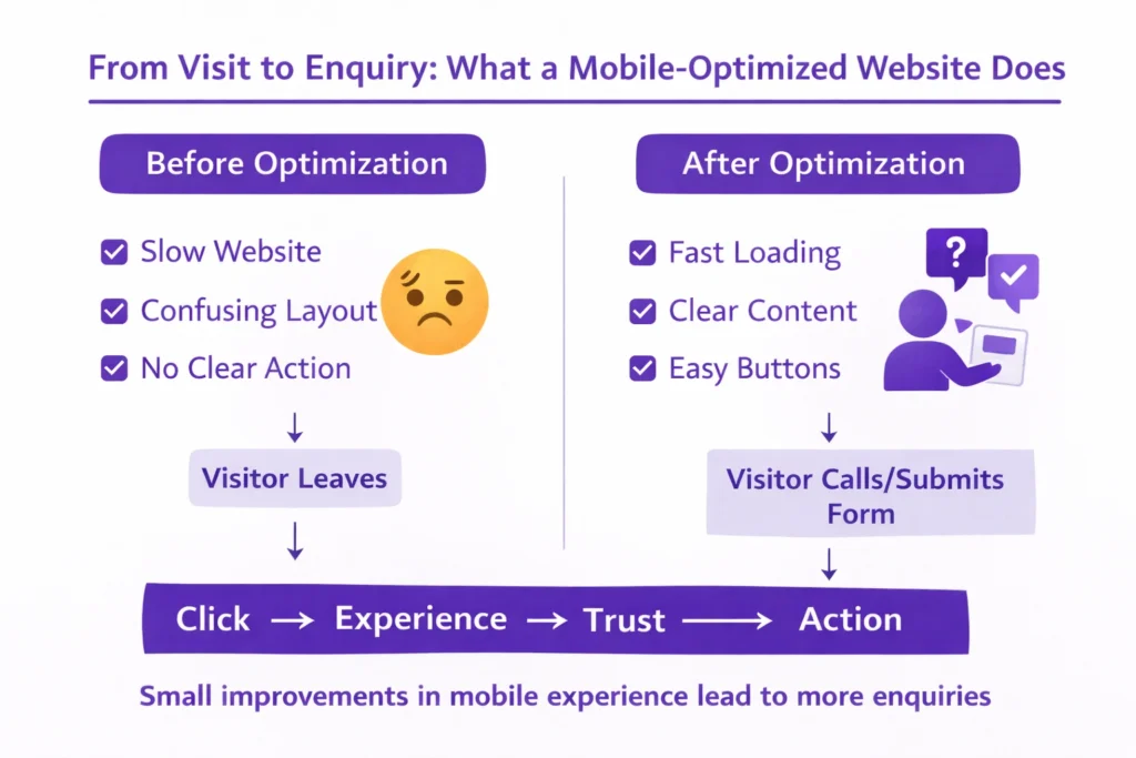
Signs Your Website is NOT Mobile Optimized
Most business owners don’t realise there’s an issue until enquiries slow down. The website is live, it looks fine, but something just isn’t working.
In my experience, the problem usually shows up in small ways that are easy to miss. But for someone visiting your site on their phone, those small issues are enough to make them leave.
Here are some common signs I’ve seen when a website is not mobile friendly.
Your Website Feels Slow on Mobile
This is one of the biggest issues behind poor mobile website performance.
If your site takes more than a few seconds to load, most people won’t wait. I’ve seen bounce rates drop noticeably just by improving load time. It’s often the difference between someone staying or leaving straight away.
Text is Hard to Read Without Zooming
If a visitor has to pinch and zoom just to read your content, it creates friction.
From working with different websites, I’ve noticed that readability plays a bigger role than most people think. Clear, well-spaced text keeps people engaged. Tight, cramped layouts push them away.
Buttons Are Difficult to Tap
This is a common mobile usability issue.
When buttons are too small or placed too close together, people end up tapping the wrong thing or giving up altogether. It might seem minor, but it directly affects whether someone contacts you or not.
Visitors Leave Without Taking Action
If you’re getting traffic but no enquiries, this is worth paying attention to.
A high bounce rate on mobile often points to experience issues rather than traffic quality. I’ve seen websites where the traffic was relevant, but the layout and usability made it hard for users to take the next step.
The overall pattern is simple. When a site feels slow, difficult, or slightly frustrating, people don’t stick around.
You might not notice these issues when checking your site quickly, but your visitors do. And they make decisions within seconds.
In the next section, I’ll walk you through the practical changes that can fix these problems and improve how your website performs on mobile.
📊 Mobile websites have bounce rates around 58–60%, compared to 48–50% on desktop.
Why it matters:
This shows that mobile users leave more often, mainly due to poor usability and experience. If your mobile site isn’t optimized, you’re losing a large portion of potential leads.
Source: DesignRush (Mobile Traffic & UX Trends Report)
12 Mobile Website Optimization Techniques
This is the part most business owners are actually looking for. What to fix, and where to start.
From working on different websites, I’ve found that you don’t need to overhaul everything at once. Small, focused improvements can make a noticeable difference, both in how your site feels and how it performs.
Here are the areas I usually look at first when improving a mobile website.
1. Improve Mobile Page Speed
If your site feels slow, this is the first thing to fix.
In my experience, improving mobile page speed alone can reduce drop-offs quickly. Heavy images, unnecessary scripts, and poor hosting are usually the main reasons behind slow loading.
If your pages take more than a few seconds, most visitors won’t stay long enough to even see your offer.
2. Use Responsive Web Design
Your website should adjust properly to different screen sizes without breaking the layout.
A good responsive website design keeps everything aligned and easy to use, whether someone is on a small phone or a larger screen. I’ve seen sites where elements shift awkwardly on mobile, which immediately affects trust.
A clean, mobile friendly design makes everything feel more natural.
3. Optimize Core Web Vitals
You don’t need to get too technical here, but these are important.
Core Web Vitals mobile checks things like how quickly your page loads, how stable it is, and how fast it responds when someone interacts with it.
From what I’ve seen, even basic improvements in these areas can help both rankings and user experience.
4. Simplify Mobile Navigation
If someone lands on your site, they should know where to go next without thinking.
Mobile UX optimization is often about removing confusion. Clear menus, fewer options, and easy access to key pages make a big difference.
I’ve worked on sites where just simplifying the navigation improved engagement without changing any content.
5. Optimize Images for Mobile
Images are one of the biggest reasons websites slow down.
Simple steps like compressing images and using the right formats can improve load time quickly. You don’t need to remove visuals, just make sure they’re not affecting performance.
6. Avoid Intrusive Popups
Popups that cover the whole screen can frustrate mobile users.
I’ve seen cases where removing or adjusting popups improved both user behaviour and rankings. Google also pays attention to this, especially when it interrupts the experience.
Keep things simple and non-intrusive.
7. Optimize for Local SEO
A lot of mobile searches are local.
People are often looking for services nearby, so your website should clearly show your location, service areas, and contact details. Mobile local SEO helps you appear in those searches where intent is high.
8. Optimize for Voice Search
More people are using voice search, especially on mobile.
These searches are usually more conversational. For example, someone might search “best plumber near me” instead of typing shorter keywords.
From what I’ve seen, clear and direct content naturally supports this without needing to force anything.
9. Use Mobile-Friendly Fonts and Layout
If your content is hard to read, people won’t stay.
Mobile readability is often overlooked. Text should be clear, spaced properly, and easy to scan. A simple layout works better than trying to fit too much into a small screen.
10. Enable Lazy Loading
This helps your website load faster by only loading images when needed.
It’s a simple improvement, but it can reduce initial load time and make your site feel smoother. It’s a common part of website performance optimization that many sites still miss.
11. Fix Mobile Technical Issues
Sometimes the problem is behind the scenes.
Mobile SEO technical issues like broken elements, layout errors, or scripts not loading properly can affect how your site works. These aren’t always visible immediately, but they impact user experience.
Regular checks help catch these early.
12. Test Your Website Regularly
Don’t assume everything is working fine.
I always recommend checking your site on different phones and screen sizes. A quick mobile friendly test can reveal issues you might not notice otherwise.
Also, try using your own website as a visitor would. Browse it, click through pages, and see how it feels.
Most of these changes are practical and don’t require a complete redesign. But together, they can significantly improve how your website performs on mobile. But together, technical and on-page SEO services can significantly improve how your website performs on mobile.
In the next section, I’ll break this down into a simple checklist you can quickly go through and apply.
A Real Example of How Mobile Issues Affect Enquiries
I’ll share a recent example because this is something I see quite often.
I worked with a UK-based client whose website looked great at first glance. Clean design, modern layout, and a lot of animations. The client was happy with how it looked, which is fair. Visually, it did the job.
But when I reviewed it properly, especially on mobile, the issues became clear.
The development team had used a lot of animations to make the site feel premium. The problem was that these elements were slowing the site down and affecting how content was displayed on mobile.
Some sections weren’t loading properly. A few important parts of the content were hidden unless you scrolled in a very specific way. The font size felt inconsistent, and the text alignment made it harder to read on smaller screens.
On desktop, none of this was obvious. But on mobile, it created a poor experience.
This is a good example of where design choices can work against performance. A website can look impressive but still struggle to bring results.
I made a few focused changes.
I simplified parts of the design, reduced unnecessary animations, and optimized the images. I also adjusted the layout so content was clearly visible and easier to read on mobile with the help of mobile website optimization services.
Nothing drastic, just practical fixes based on how people actually use the site.
Within a few weeks, the difference was noticeable. The bounce rate started to drop, and users were spending more time on the site. After about a month, rankings began to improve, and the client saw a clear increase in calls.
In my experience, this is what mobile optimization often looks like in real situations. It’s not always about big changes. It’s about fixing the small things that quietly hold your website back.
Mobile SEO Checklist
If you’re not sure where your website stands, this simple mobile SEO checklist will give you a clear starting point.
You don’t need any technical background for this. Just go through each point and check how your site performs on your own phone. That alone can reveal a lot.
From my experience, most issues show up quickly when you look at your website this way.
Basic Mobile Performance Checks
- Your website loads within 2 to 3 seconds
- Pages open smoothly without delays
- Images don’t take too long to appear
- No sections feel stuck while scrolling
Design and Layout
- Your site uses a responsive design that adjusts properly to screen size
- Text is easy to read without zooming
- Content is not cut off or hidden on mobile
- Layout feels clean and not overcrowded
Navigation and Usability
- Menu is simple and easy to access
- Buttons are clearly visible and easy to tap
- Important pages are easy to find within a few clicks
- No elements overlap or feel too close together
Content Experience
- Headings are clear and easy to scan
- Paragraphs are short and readable
- Key information is visible without too much scrolling
- Contact details are easy to find
Technical and Functionality Checks
- No mobile usability errors
- Forms are easy to fill out on mobile
- Clickable elements work properly
- No broken sections or layout issues
Real User Perspective
- You can navigate your site comfortably with one hand
- You understand what the business offers within a few seconds
- You can take action easily without confusion
This mobile optimization checklist is not about ticking every box perfectly. It’s about identifying the areas that are holding your site back.
In most cases, fixing even a few of these points can improve how your website performs, both in terms of user experience and enquiries.
In the next section, I’ll go over some common mistakes that often get overlooked but can quietly affect your results.
Common Mobile SEO Mistakes to Avoid
Even after making improvements, I often see websites held back by a few common issues. These are not always obvious, but they quietly affect how your site performs.
From working with different businesses, these mobile SEO mistakes come up again and again.
Ignoring Core Web Vitals
Many site owners don’t pay attention to how their pages actually load and respond.
Things like slow loading, layout shifts, or delays when clicking can frustrate users. I’ve seen websites where everything looks fine visually, but the experience still feels off because of these issues.
Improving these areas doesn’t just help rankings, it makes the site feel smoother to use.
Using Heavy Images Without Optimization
Images can improve a website, but only if they’re handled properly.
One of the most common mobile optimization errors is uploading large, uncompressed images. This slows down the entire site, especially on mobile networks.
In my experience, simply reducing image sizes can make a noticeable difference in speed and user behavior.
Overcomplicating the Design
Trying to make a website look impressive often leads to problems.
Too many animations, effects, or design elements can slow things down and distract users. I’ve worked on sites where simplifying the design actually improved both performance and conversions.
Clean and functional usually works better than complex.
Poor Mobile User Experience
This is a broad issue, but it shows up in small ways.
Menus that are hard to use, buttons that are difficult to tap, or layouts that feel cluttered all create friction. People don’t always know what’s wrong, they just feel it and leave.
From what I’ve seen, improving user experience often has a direct impact on enquiries.
Not Testing the Website Regularly
Some issues go unnoticed simply because no one checks.
A site might work fine after launch, but over time updates, plugins, or changes can create new problems. If you’re not testing your site on mobile regularly, these issues can build up.
Most of these mistakes are easy to fix once you spot them. The challenge is that they’re often overlooked.
In the next section, I’ll explain when it makes sense to handle this yourself and when it’s better to get proper help.
When Do You Need Mobile Website Optimization Services?
A lot of business owners try to fix things themselves first, and that makes sense. Some issues are straightforward and can be improved with small changes.
But there’s a point where DIY starts to slow you down instead of helping.
In my experience, this usually happens when the website has multiple layers of problems. Speed issues, layout inconsistencies, technical errors, all affecting performance at the same time. Fixing one thing doesn’t move the needle because something else is still holding it back.
That’s when mobile website optimization services start to make sense.
When Basic Fixes Don’t Improve Results
If you’ve already tried improving images, adjusting layouts, or using tools to test your site, but enquiries are still low, there’s usually a deeper issue.
I’ve seen cases where everything looks fine on the surface, but once you dig in, the structure, code, or loading behaviour needs proper attention.
When Your Business Starts Relying on the Website
In the early stage, a basic site might be enough.
But as your business grows and you start depending on your website for consistent leads, performance becomes more important. Small issues that didn’t matter before begin to affect real revenue.
This is where mobile SEO services become less of an option and more of a necessity.
When Technical Issues Are Holding You Back
Some problems are not easy to fix without experience.
Things like Core Web Vitals, script handling, layout shifts, or mobile usability errors often require deeper work. I’ve worked with businesses that spent months trying to fix these without real progress.
In those situations, it’s usually more efficient to hire a mobile SEO expert who deals with these issues regularly.
When You Want Consistent, Long-Term Results
Mobile optimization is not a one-time task.
Websites change, updates happen, and user behaviour shifts over time. What works today might need adjustment later.
From what I’ve seen, businesses that treat this as an ongoing process tend to get more consistent results compared to those who fix things once and leave them.
If your website is an important part of how you get enquiries, it’s worth taking mobile performance seriously.
In the final section, I’ll wrap this up and give you a simple way to move forward from here.
Final Thoughts
If your website isn’t bringing enquiries, it’s rarely just one big issue. In most cases, it’s a combination of small things that slowly affect performance over time.
Mobile experience is one of the biggest of those factors.
From what I’ve seen working with different businesses, improving mobile SEO doesn’t always require a complete rebuild. Often, it comes down to making the site easier to use, faster to load, and clearer for someone who’s visiting on their phone.
When you start to optimize your website for mobile users, you’re not just helping with rankings. You’re making it easier for real people to understand what you offer and take action without friction.
Not Sure What’s Holding Your Website Back?
Get a quick review with clear, practical fixes you can apply.
That’s where the real value comes in.
It’s also worth keeping in mind that SEO is not a one-time fix. Websites evolve, competitors improve, and user behaviour changes. What works today might need adjusting a few months down the line.
The businesses that get consistent results are usually the ones that keep refining things as they go.
If you treat mobile optimization as an ongoing part of your website, rather than a one-off task, it becomes a real advantage. Not just in terms of visibility, but in how your website actually supports your business. And in the end, that’s what matters.
FAQs
How do I know if my website is not mobile friendly?
In my experience, the easiest way is to check your site on your own phone.
If pages load slowly, text feels hard to read, or buttons are difficult to tap, those are clear signs. I’ve also seen cases where content looks fine on desktop but appears broken or hidden on mobile.
Another strong indicator is behavior. If people visit your site but don’t take any action, there’s usually a mobile usability issue behind it.
Why is mobile optimization important for SEO?
Because Google now uses mobile first indexing.
That means your mobile version is what gets evaluated for rankings. Also, more than half of website traffic comes from mobile devices, so user experience plays a direct role in how your site performs.
From what I’ve seen, even small improvements in mobile experience can lead to better rankings and more enquiries.
How can I improve my website speed on mobile?
Start with the basics.
Reduce image sizes, remove unnecessary animations, and check your hosting performance. In many cases, large images and extra scripts are the main reasons behind slow loading.
I’ve worked on websites where just optimizing images and simplifying design improved speed noticeably without major changes.
What are the most common mobile SEO mistakes?
The most common ones I see are:
- Using heavy images that slow down the site
- Ignoring loading speed and usability
- Overcomplicating design with animations
- Not checking how the site actually works on mobile
These small issues add up and lead to poor mobile website performance over time.
How long does it take to see results after mobile optimization?
It depends on the condition of the website.
In some cases, I’ve seen improvements in user behavior within a few weeks. Rankings usually take longer, often a few weeks to a couple of months, depending on competition and how many issues were fixed.
The key thing is consistency. One-time fixes help, but ongoing improvements bring better results.
Can I do mobile optimization myself or do I need an expert?
You can handle basic improvements yourself.
Things like checking layout, improving readability, or compressing images are manageable. But when it comes to deeper issues like speed, structure, or technical fixes, it often makes more sense to get help.
I’ve seen many business owners spend months trying to fix things that could be resolved much faster with the right approach.
Does mobile optimization really increase enquiries?
Yes, and I’ve seen this directly.
When a website becomes easier to use, faster, and clearer on mobile, more people stay, engage, and take action. It’s not about traffic alone, it’s about what happens after someone lands on your site.
In simple terms, better mobile experience leads to better conversion.
Deepak Sharma is an SEO consultant with 10+ years of experience helping small businesses improve website performance, attract the right traffic, and turn visitors into enquiries through practical, results-focused SEO.
Recent Blogs
- Common WordPress Mistakes That Stop You Getting Leads
- Why a Good-Looking Website Doesn’t Convert
- Does SEO still work for small businesses in 2026?
- Why Your Website Isn’t Generating Leads and How to Fix It
- Why SEO traffic doesn’t turn into enquiries
- How Long Does SEO Take for a Small Business?
- Why a Slow WordPress Site Kills Your Enquiries