
Modern Web Design Trends That Actually Improve UX (Not Just Look Cool)
Modern web design trends should do more than make a website look attractive. They should improve user experience, build trust, and help visitors take action. This guide explores practical design strategies that create faster, clearer, and more effective websites that support real business growth and lead generation.

Guruparshad
Website Developer
July 19, 2026 | 6 min. read

Table of the content
- 1. Cleaner Layouts That Reduce Confusion
- 2. Stronger Typography and Better Readability
- 3. Mobile-First Design That Feels Natural
- 4. Design That Supports Real Business Goals
- 5. Faster Websites With Lighter Visual Effects
- 6. Clearer Calls to Action
- 7. Trust-Building Design Elements
- 8. Better Website Structure and Navigation
- 9. Accessible Design Choices
- 10. Content-Led Design
- 11. Helpful Interactivity, Not Gimmicks
- Final Thoughts
Web design trends change quickly. One year, everyone wants large hero videos. The next year, minimalist layouts, AI chat widgets, animated buttons, dark mode, or glass-style sections become popular. Some trends genuinely make websites easier to use. Others only make them look modern for a short time before they start feeling heavy, distracting, or unnecessary.
For business websites, the real question should not be, “Does this look trendy?” It should be, “Does this help visitors understand, trust, and take action faster?”
A website can look beautiful and still frustrate users. It can have impressive animations but poor readability. It can use the latest design style but hide the contact button. Good design is not decoration. It is a practical layer between the business and the person trying to make a decision.
Here are some modern web design trends that are actually useful when applied with purpose.
1. Cleaner Layouts That Reduce Confusion
Minimal design is not new, but it remains one of the most useful trends when done properly. Many older business websites try to say everything at once. They fill the homepage with sliders, multiple offers, long paragraphs, small icons, popups, and too many menu items.
A cleaner layout gives visitors breathing room. It helps them quickly understand what the business does, who it serves, and where to go next.
This does not mean a website has to look plain or empty. It means each section should have a job. The hero section should communicate the main value clearly. Service sections should be easy to scan. Calls to action should be visible. Supporting details should appear where they help the visitor make a decision.
In practice, clean design improves UX because it reduces mental effort. Visitors do not want to decode a website. They want to know whether they are in the right place.
2. Stronger Typography and Better Readability
Typography is often treated as a visual choice, but it has a direct effect on usability. If the text is too small, too light, too cramped, or difficult to scan, visitors will leave even if the content itself is valuable.
Modern websites are moving toward larger body text, clearer headings, better line spacing, and stronger contrast. This is not just a style preference. It helps people read comfortably on phones, laptops, tablets, and larger screens.
Good typography also creates hierarchy. A visitor should be able to scan a page and understand the main points before reading every word. Headings, subheadings, short paragraphs, bullet points, and highlighted statements all make content easier to digest.
This is especially important for service businesses, consultants, agencies, SaaS companies, healthcare providers, legal firms, and B2B websites. These visitors often need to understand complex information before they enquire. Better readability can directly support better conversions.
3. Mobile-First Design That Feels Natural
Responsive design is now expected, but there is a difference between a website that technically works on mobile and one that is genuinely comfortable to use on mobile.
Many users first discover a business from their phone. They may search quickly, compare options, open a map listing, click from social media, or read a blog post on the move. If the mobile experience is poor, they may never return on desktop.
Modern mobile UX also means removing unnecessary friction. A phone number should be clickable. Forms should have only the fields that are truly needed. Navigation should not feel like a puzzle. The visitor’s thumb should be considered part of the design process.
4. Design That Supports Real Business Goals
A modern website should not be built only around visual trends. It should be shaped around what the business wants visitors to do and what visitors need before they feel ready to act.
For example, a local service business may need calls and appointment bookings. A B2B company may need qualified enquiries. An eCommerce brand may need smoother product discovery and checkout. A consultant may need trust, clarity, and a strong explanation of expertise.
When design starts with business goals, the layout becomes more useful. The homepage does not just look attractive; it introduces the business clearly. Service pages do not just list offerings; they answer questions and remove doubts. Contact sections do not feel like an afterthought; they become a natural next step.
This is why businesses benefit from websites shaped around real business goals rather than websites designed only to follow the latest visual style. A good website should connect design, content, user experience, and conversion strategy in a way that supports the business behind it.
5. Faster Websites With Lighter Visual Effects
Animation can improve UX when it guides attention. But too much movement can slow a website down and distract visitors from the message.
One of the most useful modern trends is the shift toward performance-conscious design. Designers and developers are becoming more selective with videos, heavy sliders, complex scripts, and oversized images. A fast website feels more professional and creates less frustration.
Speed affects almost every part of UX. A visitor who waits too long may abandon the page before reading anything. A slow form may reduce enquiries. A heavy mobile page may perform badly for users with weaker connections.
The best modern websites still feel polished, but they are not overloaded. They use optimized images, lightweight code, proper caching, and purposeful animations. The result is a site that looks good and works smoothly.
For business owners, performance should not be treated as a one-time launch task. Websites need updates, plugin checks, security monitoring, backups, and performance reviews over time. Having support for keeping WordPress websites updated and performing well can help prevent a polished website from becoming slow, outdated, or vulnerable after launch.
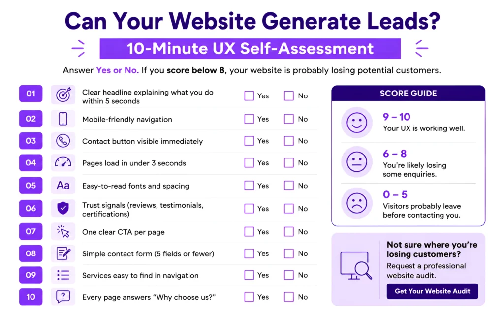
6. Clearer Calls to Action
A website should guide visitors toward the next step. This may sound obvious, but many websites still make users guess what to do.
Modern UX-focused design uses clearer, more consistent calls to action. A homepage may guide users to book a consultation, request a quote, view services, download a guide, or speak to an expert. A product page may help users compare options. A blog post may suggest a related resource.
The key is relevance. A call to action should match where the visitor is in the journey. Someone reading an introductory article may not be ready to buy, but they may be ready to learn more. Someone comparing service pages may be ready to contact the company.
Good CTAs are visible without being aggressive. They use clear language. They appear at natural decision points. They help the visitor continue instead of interrupting them.
For example, “Get Started” may work for some pages, but “Request a Website Review” or “Book a Free Consultation” may be more useful when the action is specific. The best CTA is not always the most clever one. It is the one that makes the next step obvious.
7. Trust-Building Design Elements
Trust is a major part of user experience. Visitors want to know whether a business is real, capable, and reliable before they contact it.
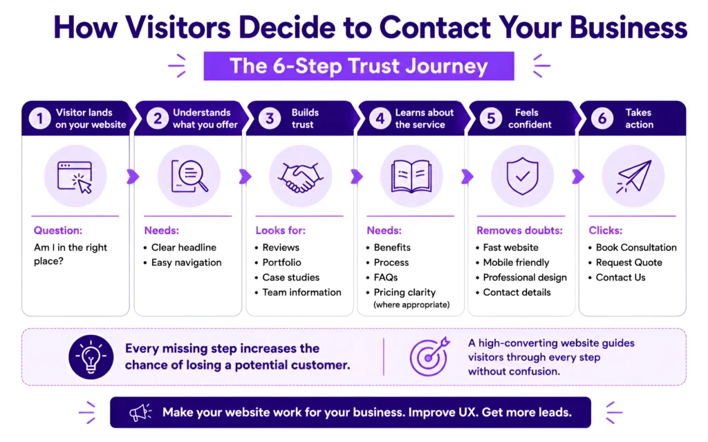
Modern websites increasingly use trust signals throughout the user journey rather than hiding them on one page. These signals may include testimonials, reviews, client logos, case studies, certifications, team photos, project results, office details, process explanations, FAQs, and clear contact information.
The important thing is to make trust feel natural. A page filled with badges and claims can look forced. But a well-placed testimonial after a service explanation can reassure the visitor at the right moment. A case study near a call to action can reduce doubt. Real project images can be more convincing than stock photos.
Trust-building is not only about what is shown. It is also about what is avoided. Confusing pricing, vague promises, broken links, missing contact details, and outdated design can all create doubt.
A modern website should make the visitor feel that the business is active, transparent, and easy to talk to.
8. Better Website Structure and Navigation
A common UX problem is poor structure. Visitors arrive on a website and do not know where to go. Services are grouped strangely. Menus are too long. Important pages are buried. Blog content is not connected to service pages. Internal links are random or missing.
Modern websites are paying more attention to information architecture. This means organizing content around how users think, not just how the business is internally structured.
For example, a company may offer design, development, hosting, maintenance, and SEO. But a visitor may be thinking, “I need a new website,” “I need to redesign an old website,” or “I need help fixing my current site.” The website structure should support those real user needs.
Good navigation improves UX because it reduces confusion. Visitors should be able to move from broad information to specific details without feeling lost. Breadcrumbs, related links, clear page titles, and logical menus all help.
This also supports SEO because search engines can better understand the relationship between pages. But the main benefit is still human: people find what they need faster.
9. Accessible Design Choices
Accessibility is not just a compliance topic. It is a better design habit.
Accessible websites use readable text, strong color contrast, keyboard-friendly navigation, descriptive links, alt text for images, clear form labels, and layouts that do not depend only on color or movement.
These choices help users with disabilities, but they also improve usability for everyone. A clear form label helps all users. High contrast helps people reading outdoors on a phone. Descriptive buttons help visitors understand where a link will take them.
Modern web design is moving away from purely visual thinking and toward inclusive usability. A website should not only impress people who have perfect conditions, fast internet, and large screens. It should work well for real users in real situations.
10. Content-Led Design
One of the most useful trends is designing around content instead of forcing content into a pre-made layout.
A website is not just a container for images and buttons. It is a communication tool. The design should support the message, not compete with it.
Content-led design starts by asking questions such as:
What does the visitor need to know first?
What objections might they have?
What proof will help them trust the business?
What action should they take next?
Which information belongs on the page, and which can be linked elsewhere?
This approach usually creates better pages because the design is built around real user intent. It avoids generic sections that look nice but say very little.
For example, a service page should not simply say what a company offers. It should explain who the service is for, what problems it solves, how the process works, what results can be expected, and why the visitor should trust the business. That is where UX and content strategy meet.
11. Helpful Interactivity, Not Gimmicks
Interactive elements can improve UX when they help visitors choose, compare, or understand something faster.
Examples include pricing calculators, service selectors, interactive FAQs, comparison tables, filters, step-by-step forms, and guided quote requests. These tools can make a website feel more useful because they respond to the visitor’s needs.
However, interactivity should not be added just for entertainment. If a feature slows the page down or distracts from the main task, it may hurt the experience. The best interactive elements simplify decisions.
For example, a service business may use a short guided form to understand what a visitor needs. A SaaS website may use an interactive calculator to show potential savings. An eCommerce site may use filters to help users narrow choices quickly.
Good interactivity feels helpful, not gimmicky.
Final Thoughts
Modern web design is not about copying whatever looks popular this year. A trend is only valuable if it helps real users.
Clean layouts, better typography, faster pages, mobile-first design, clear calls to action, trust signals, accessible choices, and content-led structure all improve user experience because they make websites easier to understand and easier to use.
See How Your Website Can Improve
Discover practical improvements that help your website attract and convert more visitors.
The strongest websites are not always the loudest or most visually dramatic. They are the ones that remove friction, answer questions, build trust, and guide visitors naturally toward the next step.
A good test is simple: if a design choice helps the visitor, keep it. If it only exists to look impressive, question it. Great UX is not about showing off. It is about making the visitor’s journey feel clear, comfortable, and worthwhile.
Guruparshad is a WordPress developer at Digital Deep Tech who creates user-focused websites that balance modern design, performance, and usability to help businesses build trust and generate more enquiries online.
Relevant Blogs
- Why Ongoing SEO Matters More Than a One-Time Website Fix
- 27 Important Questions to Ask an SEO Company Before
- How to Find the Best SEO Company for
- Google Business Profile Mistakes Losing You Leads
- How to Choose the Best Voice SEO Company in 2026?
- SEO for Fitness Businesses: How Gyms & Trainers Get Clients from Google