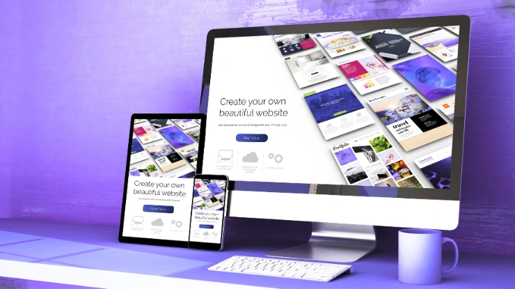
Your website deserves more than just a pretty layout—it should work beautifully on every screen. At Digital Deep Tech, we build responsive websites that feel right on mobile, desktop, or tablet. No tech jargon, no fluff—just clean, user-first design that works for your business and your customers. Let’s create something that connects, loads fast, and actually performs.
Why Responsive Web Design Is Non-Negotiable in Today’s World
It’s no longer a nice-to-have — your website must work seamlessly across all devices. As user behavior evolves, so does the expectation for smooth, fast, and accessible experiences everywhere, especially on mobile.
Over 59% of global website traffic now comes from mobile devices (source: Statista)
Google ranks mobile-optimized websites higher, thanks to mobile-first indexing
Non-responsive sites see higher bounce rates and fewer conversions
Customers switch between phones, tablets, and laptops — often in one session
Your audience won’t wait — if your site doesn’t load well on mobile, they’re gone. We design mobile and desktop responsive web design that not only looks great but performs where it matters most — on every screen, for every user.
Common Problems Businesses Face With Unresponsive Websites
If your website doesn’t adapt to screen sizes, you’re likely losing more than just traffic—you’re losing trust, credibility, and potential customers. Many businesses don’t realize their site is turning people away until it’s too late.
Pages break or misalign on mobile phones and tablets
Visitors have to pinch, zoom, or scroll endlessly just to read content
Your brand looks outdated or unprofessional at first glance
Frustrated users leave before taking any action — meaning lost sales
Google quietly drops your rankings due to poor mobile usability
Negative UX impacts your word-of-mouth and referral traffic
A few seconds of bad experience can cost you more than you think. Let’s fix your non responsive website and improve your website responsiveness before it affects your growth.
Our Mobile-First Responsive Web Design Services
Most of your visitors won’t visit your website from a desktop. They’ll see it while commuting, scrolling on the couch, or waiting in line. That moment matters — and if your site doesn’t look right or load fast, they’ll bounce. That’s why we design with mobile-first thinking from the start. We shape every element for smaller screens, then scale it up — not the other way around.
Meet Us - Digital Deep Tech
We’re a small team that builds with purpose, not pretense. No fluff, no filler — just websites that connect with people and move your business forward.
We don’t just resize desktop designs. We think in small screens first — with cleaner layouts, thumb-friendly buttons, and the right info up front.
Seamless Experience on Every Screen
Phones. Tablets. Laptops. Desktops. We make sure your site adjusts naturally without stretching, overlapping, or falling apart in weird ways.
Clarity That Guides the User
People should know what to do next — without second guessing. We keep the structure simple and intuitive so visitors never feel lost or stuck.
Flexible Grids, No Limitations
As your site grows, it should hold together — not fall apart. We build with grids that flex as needed, without breaking the flow.
Lightning-Fast Loading Speed
We trim down bloat, optimize visuals, and clean up code — so your site opens fast, runs smooth, and doesn’t frustrate your users.
Visuals That Stay Sharp Anywhere
High-res screens. Low-end devices. It doesn’t matter. We tune every asset so your site looks crisp and clean wherever it’s being viewed.
Tailored for Global Businesses & Local Brands Alike
Whether you’re running a small local business or managing an international brand, your website needs to show up right — everywhere. We’ve designed for teams across Australia, the US, UK, and UAE, and what we’ve learned is simple: no two businesses are the same. That’s why we build responsive websites that adapt not just to screens, but to your market, your users, and your voice.
E-commerce Brands
Designed to sell fast and look sharp — across every device, every cart, every scroll.
Professional Service Firms
Trust-building, mobile-ready websites that turn searches into consultations.
Local Small Businesses
Your storefront online — optimized for location, visibility, and credibility in your community.
International Brands
Scalable, multilingual-ready responsive layouts with consistent performance worldwide.
Consultants & Coaches
A responsive platform to tell your story, share your expertise, and convert leads into clients.
Startups & Founders
Clean, responsive design that makes your early-stage brand look like it’s been there for years.
Built for Your Industry, Not Just the Internet
At Digital Deep Tech, we don’t do cookie-cutter websites. We take time to understand your industry, your pain points, and the customers you’re trying to reach. From cross-device website design to responsive layout optimization, every detail is tuned to help your business connect, grow, and stand out — no matter where you’re based.
Ready to Get a Responsive WebsiteThat Works
No bloated templates. No waiting months. Just thoughtful, mobile-friendly design built for results — and real people.
We don’t just build websites — we build long-term partnerships. From small business owners to CEOs, our clients trust us to deliver websites that don’t just look good, but perform. Here’s what a few of them had to say after working with our team at Digital Deep Tech.
Tom HannemannResume Writing Expert & Coach
I am Tom Hannemann, completely satisfied with Deepak’s work. He fully honored the commitment he made to me. Initially, there was no traffic on my website, and the ranking of keywords was significantly low. However, after 3 months, I began to see positive results.
Ilbey UcarPsychologist
I was very pleased to work with Deepak. In addition to the limited budget, the recession in the world economy unfortunately caused me to temporarily stop this project. However, Deepak is always responsible, organized and disciplined.
Andrew ZimbaBusiness Owner at ZIMBA AIR OY
It was very good and professional. I would recommend it. I follow Deepak on LinkedIn, and he helps me understand my business website issues. He audited my website and gave me a clear plan of what I need to do. Thanks for helping me learn about SEO.
Subhan AhmedTech Researcher | Tech Blogger
Deepak conducted a comprehensive website audit for us, identifying key issues and providing actionable insights. His expertise was invaluable in optimizing our site for better performance and SEO.
Case Studies. One Message: It Works.
Real transformation doesn’t happen by chance — it comes from strategy, experience, and doing the work that others avoid. Here’s how we helped two very different brands improve performance, visibility, and user experience through thoughtful, responsive design and optimization.
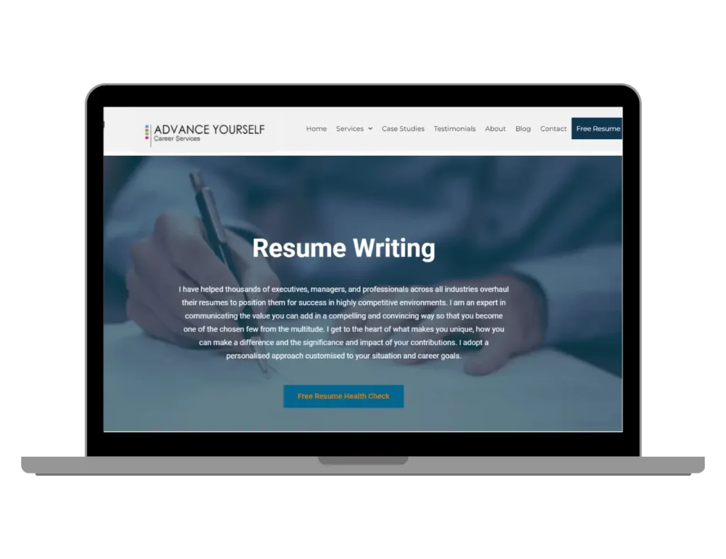
About the Project: Tom Hannemann had years of experience helping jobseekers, but his website wasn’t keeping up. He needed stronger visibility across Australia and a user-friendly design that supported both his resume writing and coaching services.
The Results: In just 90 days, Tom saw a 200% increase in qualified leads. We rebuilt his site’s structure, published fresh SEO content, improved responsiveness, added 500+ monthly backlinks, and brought 20+ keywords into Google’s top 3 rankings.
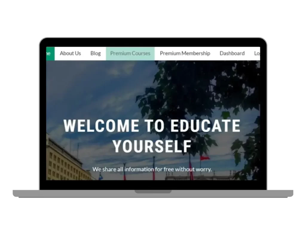
About the Project: This free learning platform was growing fast, but performance lagged — slow load times, bloated images, and poor mobile experience. They needed a redesign that could scale with their users.
The Results: After a full responsive overhaul, the site’s bounce rate dropped by 65%. We implemented mobile-first speed plugins, optimized all visuals, and ensured the design worked flawlessly on phones, tablets, and desktops.
Why Choose Digital Deep Tech as Your Responsive Web Design Partner
We’re not a huge agency — and that’s exactly why our clients trust us. For over 7 years, we’ve worked side-by-side with startups, local businesses, and global teams to build websites that aren’t just responsive — they’re smart, fast, and built to convert.
We blend thoughtful design with real SEO strategy, so your site not only looks great across every device — it gets found, too. Our process is simple, honest, and built on communication. No jargon. No disappearing acts. Just a team that shows up, delivers on time, and scales as you grow.
That’s what makes us more than a responsive website design services company. We’re your design partner, and we’re in it for the long run.
Let’s Build Something That Actually Supports Your Growth
Hire a Responsive Web Designer Who Understands Your Business
We don’t just design websites — we help business owners turn underperforming sites into tools that work. Whether you’re a startup, solopreneur, or scaling brand, we create flexible, ROI-focused solutions that align with your goals — not just pixels and code.
Does your site look different on mobile vs desktop?
Are buttons or text hard to tap or read?
Does it load slowly on mobile networks?
Are users abandoning your pages quickly?
Want to Know Why Your Site Isn’t Performing?
Sometimes, the problem isn’t what’s missing — it’s what’s broken. With our free website audit, we’ll show you what’s holding your site back, and how to fix it. No pressure. No jargon. Just honest insight from a team that gets it.
FAQ About Our SEO Services
What’s included in your responsive web design services?
We begin by understanding what matters most to you — your goals, audience, and vision. From there, we create a mobile-first design that adjusts smoothly to every device, whether it’s a smartphone, tablet, or desktop. Our services include:
Custom UI/UX tailored to your users
Fully responsive layouts
Fast load times and image optimization
Cross-browser compatibility checks
Clean, SEO-friendly code
It’s not about packing in features you don’t need. It’s about building a website that just works — and feels right for your visitors.
How do I check if my website is responsive?
Here’s a quick test: open your site on your phone. Does it look clean? Easy to read? Buttons easy to tap? Or does it feel cramped, with elements out of place?
Another way — resize your browser window on a desktop. If things overlap or scroll awkwardly, that’s a sign your site isn’t responsive. You can also try Google’s Mobile-Friendly Test. And if you’re still unsure — we’re happy to check it for you.
My current website isn’t mobile-friendly. Can you fix it?
Absolutely — and without reinventing the wheel. If your site feels outdated or breaks on smaller screens, we can give it a full mobile-first upgrade. We’ll preserve what works, improve what doesn’t, and deliver a smoother, faster, and better-looking experience — all while keeping your brand intact.
Will a responsive website help with SEO?
Definitely. Google now prioritizes mobile-first indexing, meaning your search visibility can suffer if your site doesn’t perform well on mobile. A responsive design improves usability, reduces bounce rate, and helps users stay engaged — which search engines love. So yes, smart design = better SEO.
How long does it take to design a responsive website?
On average, most responsive websites take 2 to 4 weeks to design and develop — depending on how complex your site is. If you’re on a tighter timeline, we’ll map out a custom plan to hit your deadline without sacrificing quality. You’ll be looped in at every step.
Is responsive design better than adaptive design?
For most businesses — yes. Responsive design automatically resizes across devices, so you don’t need multiple versions of your site. It’s more flexible, easier to maintain, and future-ready. Adaptive design uses fixed layouts for specific screen sizes — which can be useful in rare cases, but we usually recommend responsive as the smarter long-term approach.
What types of businesses do you work with?
We work with people — not just industries. That includes:
E-commerce brands
Coaches and consultants
Local service providers
Tech startups and SaaS teams
Education platforms and nonprofits
Whether you’re just getting started or scaling fast, we adapt our designs to fit your audience and your next stage of growth.
Do you have examples of your work?
Yes, and we love sharing them. Visit our Case Studies to explore real stories — from increased traffic and engagement to better mobile performance. If you’re curious about results in your industry, just ask. We’re proud of our work, and even prouder of the clients behind it.
Let’s Talk About Making Your Website Truly Responsive
Let’s build something better. Something you’re proud to share.


